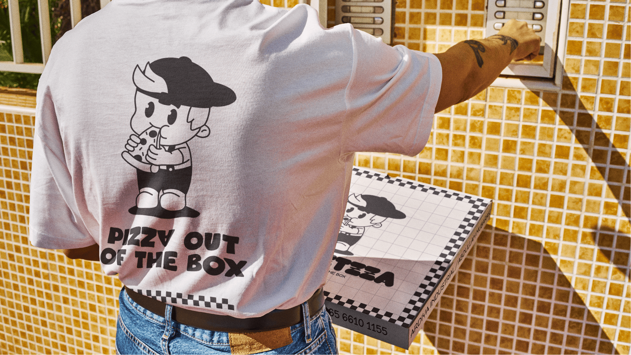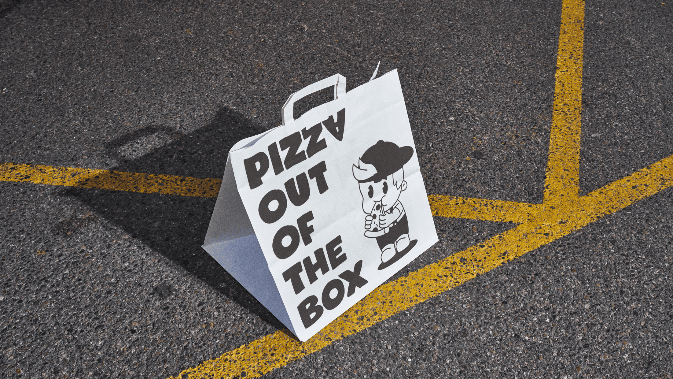
The Project. Streetzza is an urban pizzeria built around speed, street energy, and straightforward food. The challenge was to create a visual identity that feels bold and recognizable without falling back on familiar “Italian” clichés. The brand needed to work in a busy city environment, communicate fast, and still feel intentional rather than noisy.
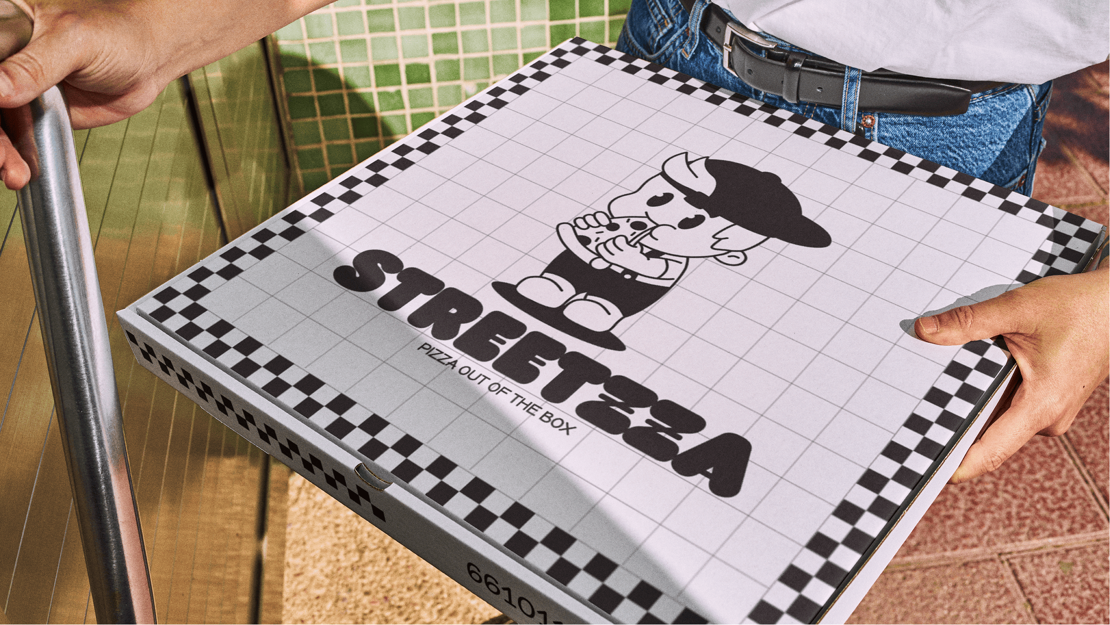
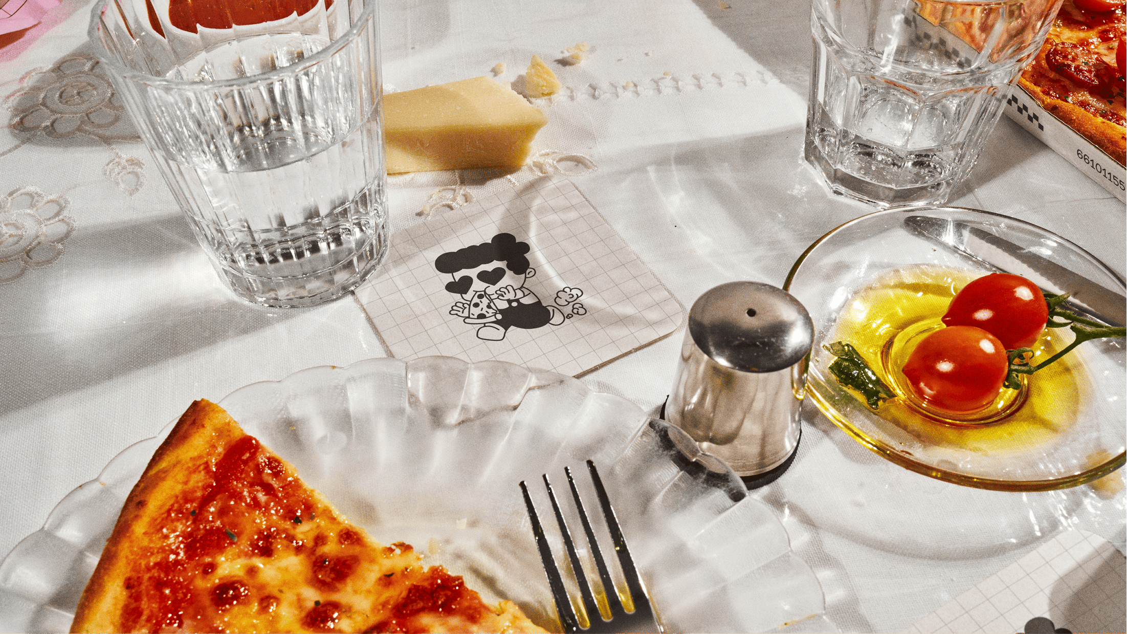
The identity was designed as a flexible system rather than a fixed set of assets. It combines an expressive wordmark, a modular grid of graphic patterns, simplified iconography, and a poster-inspired visual language. Color and typography are driven by contrast — rough, urban references balanced with a clean, modern structure — allowing the brand to feel raw but controlled.
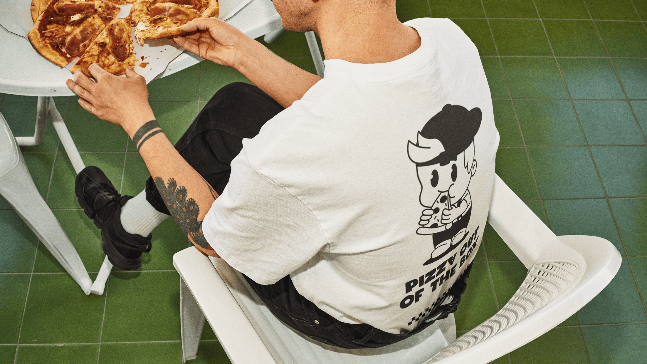
The experience is immediate and practical. Customers encounter a cohesive visual environment: large headlines, clear pricing, readable menus, and packaging that works equally well in hand and on camera. The system is built for speed — of perception, of service, and of production — reinforcing a sense of “juicy, fast, honest” without explanation.
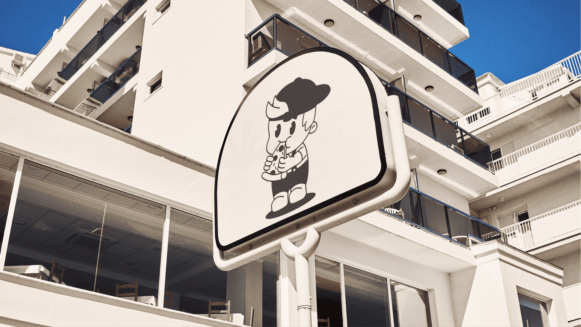
Innovation. The project’s innovation sits in its use of street typography as the core engine of the brand. The wordmark and pattern grid aren’t decorative elements; they function as a modular toolset that adapts easily across signage, packaging, menus, and social media.
The deliberately poster-like logic simplifies updates and reduces friction in day-to-day operations, from menu changes to promotional materials. At the same time, it leaves a strong visual trace in crowded environments, helping Streetzza stand out quickly and remain consistent across both physical and digital touchpoints.