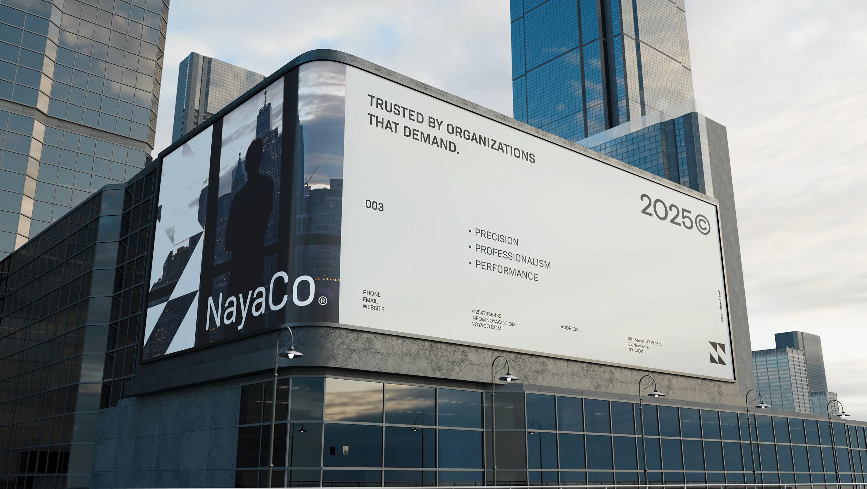
The Project. NayaCo needed a brand that could hold its ground in a traditional, competitive space without disappearing into the usual corporate look-and-feel. The audience spans both public and private sector clients, so the identity had to signal authority and competence, but still feel approachable. That balance is harder than it sounds—too formal and it becomes generic, too “modern” and it risks losing credibility.
The resulting identity is built around trust, structure, and clear intent. Visually, it’s minimal, bold, and controlled. Messaging supports the same position, framing NayaCo as a reliable partner for high-stakes work where discipline and accountability matter more than promises.
The experience carries through the full service scope, from planning to delivery. The design system stays calm and legible across touchpoints, giving the brand a consistent presence that feels professional without being stiff. It’s designed to work in the real world—where decisions get made quickly and confidence is often built on small signals.
Innovation. The most valuable choice here is restraint. Instead of chasing distinction through novelty, the identity creates differentiation through clarity, tone, and structure. That’s what allows it to speak to two very different sectors without splitting into two brands.
In a market full of polished but interchangeable identities, NayaCo’s system treats credibility as a design requirement. It’s built to last, scale, and stay readable under pressure—which is usually the real test.