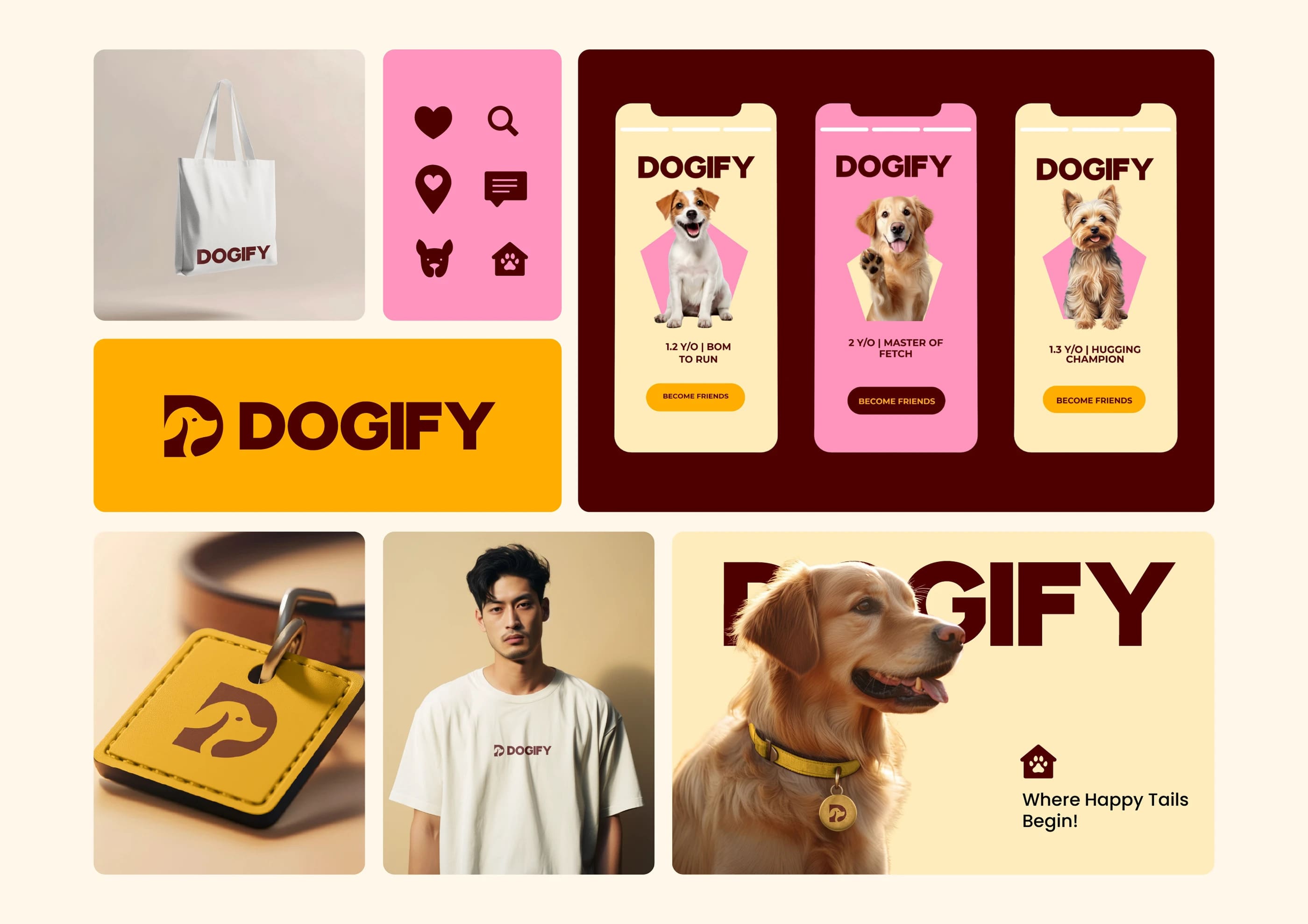
The Project. DOGIFY set out to rethink how modern pet brands present themselves. The brief moved deliberately away from cartoonish visuals and interchangeable “cute” branding toward something more composed — stylish, confident, and easy to recognize. The identity needed to speak to a new generation of pet owners who see pet care as part of their lifestyle, not a separate category.
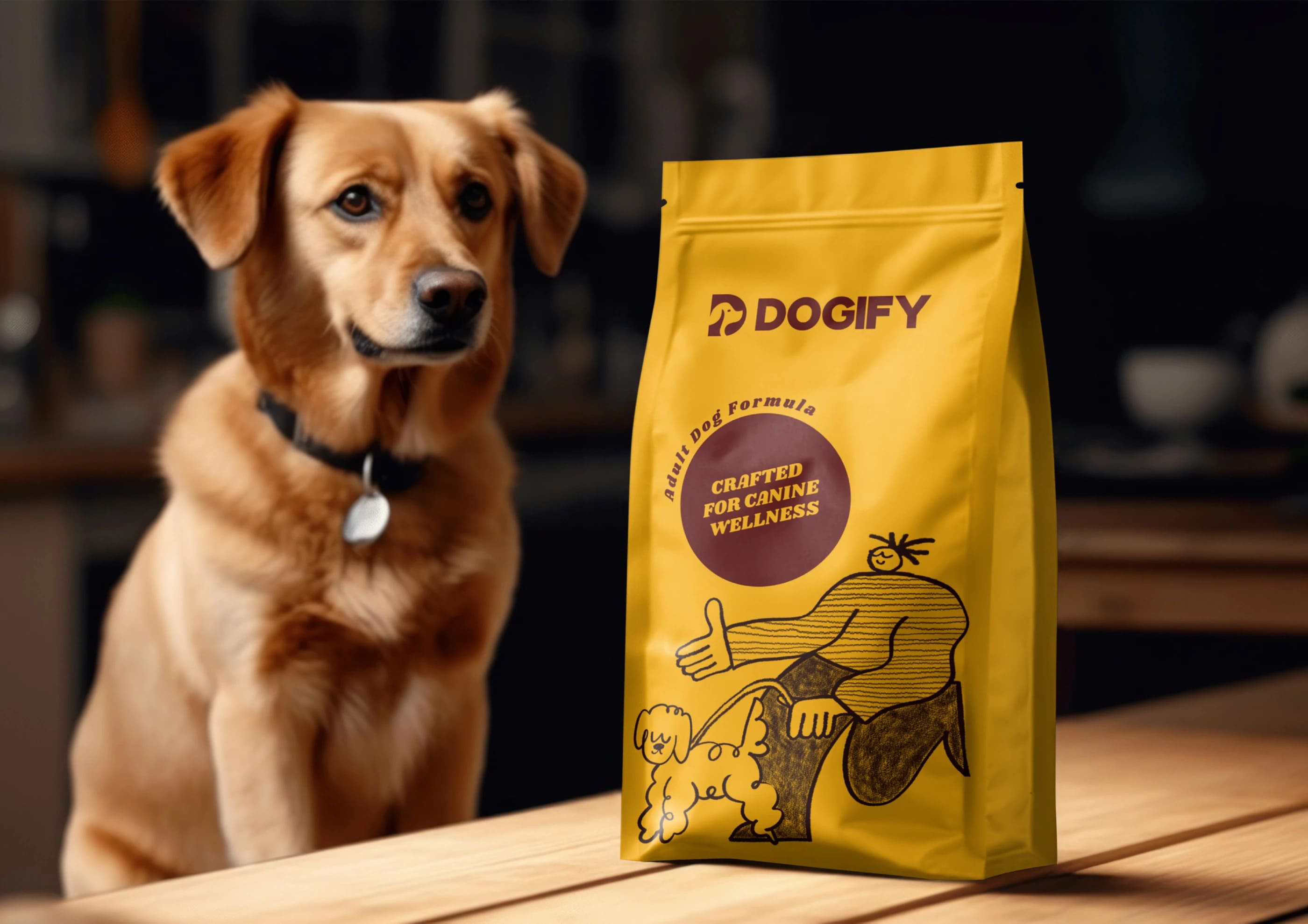
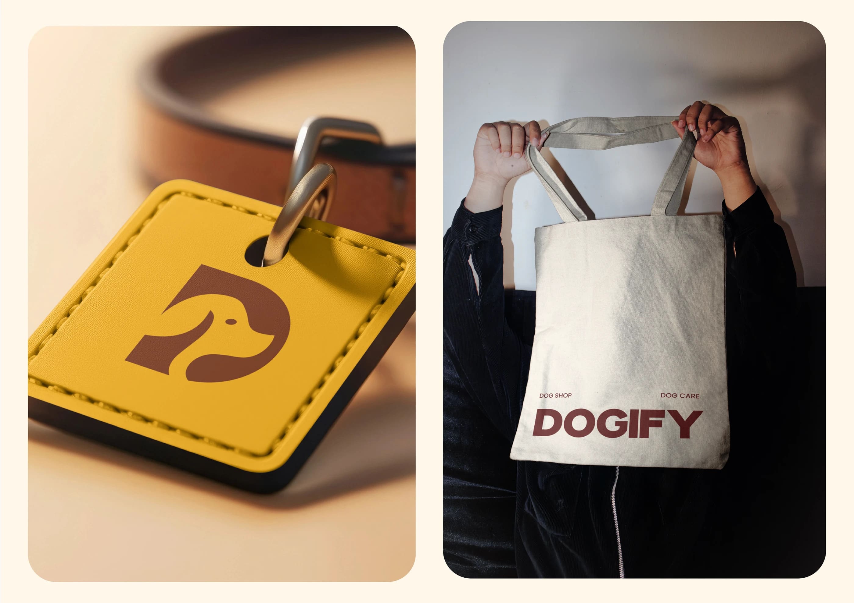
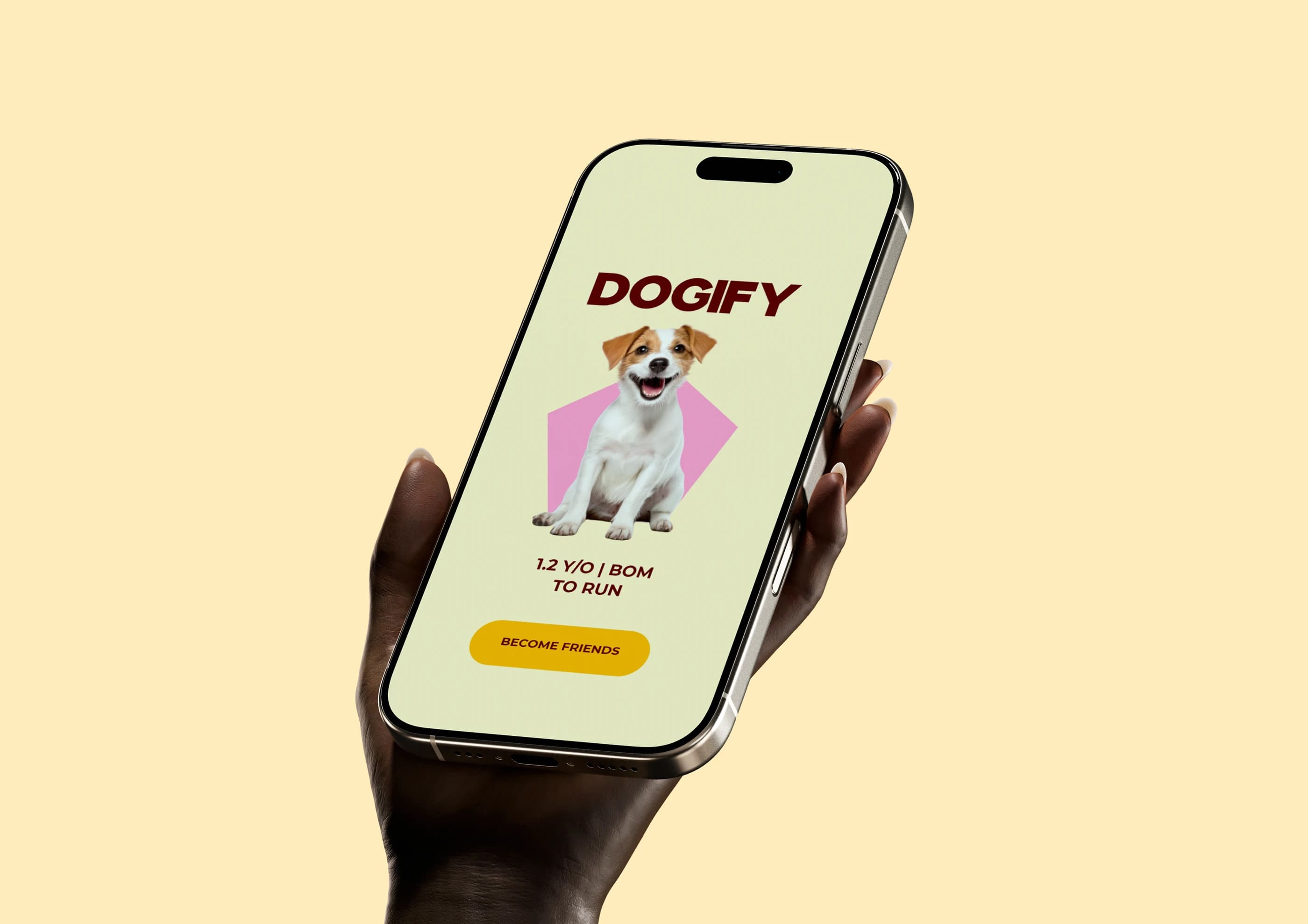
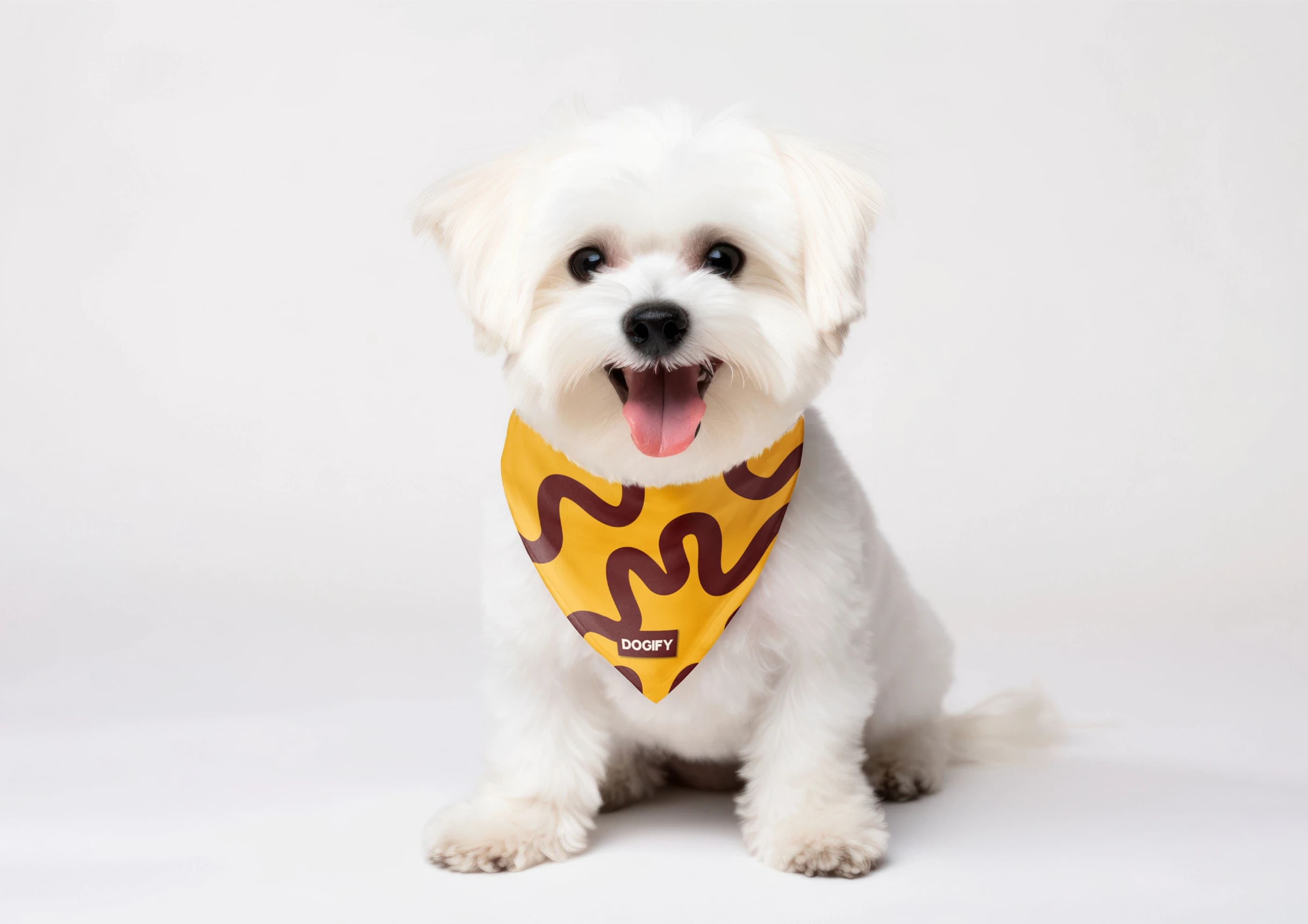
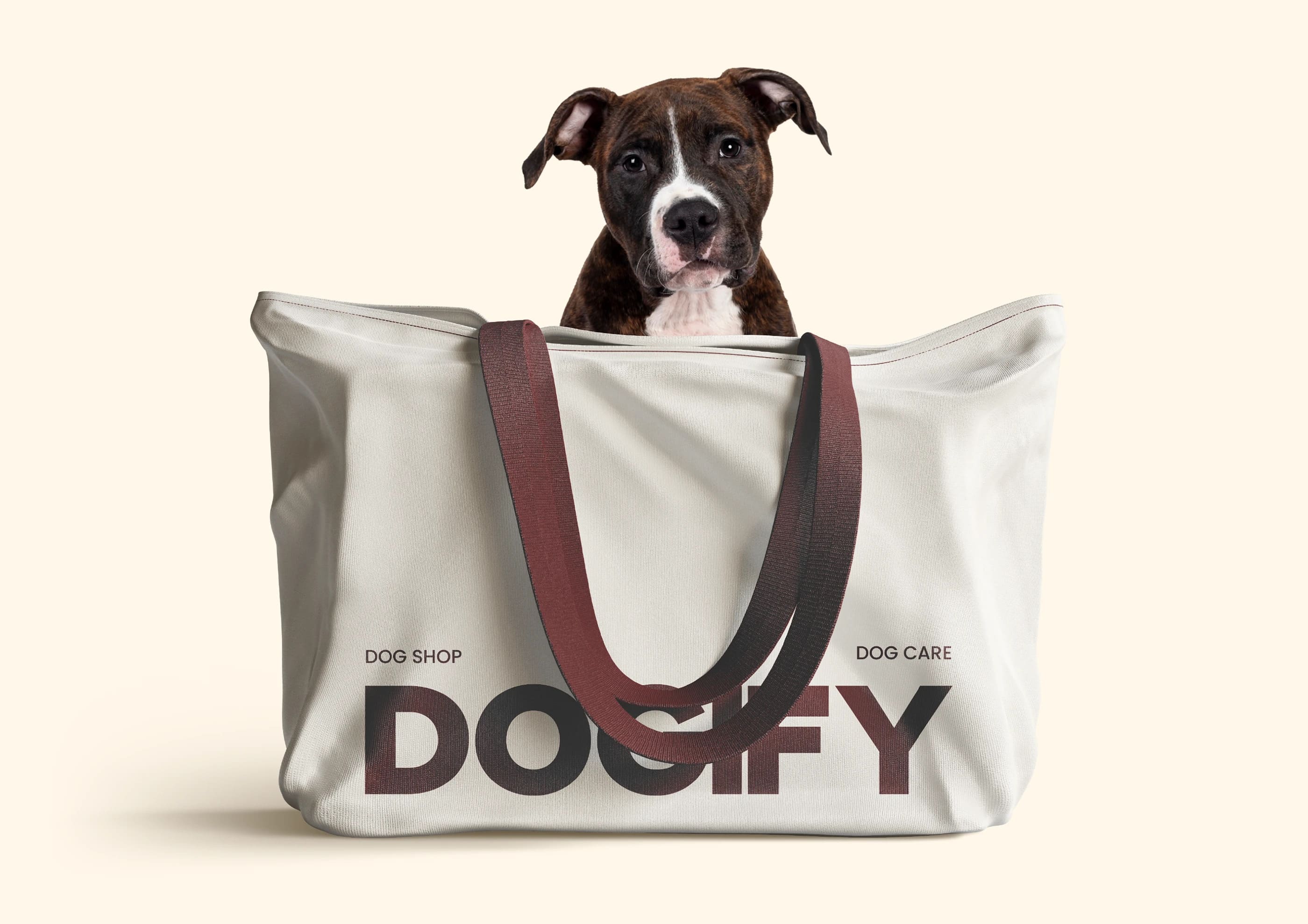
The solution was built around clear geometry, strong typography, and a vibrant but controlled color system. Each element was chosen to balance warmth with structure. The logo, in particular, carries a sense of play without tipping into novelty, allowing it to work consistently across digital products, packaging, and print.
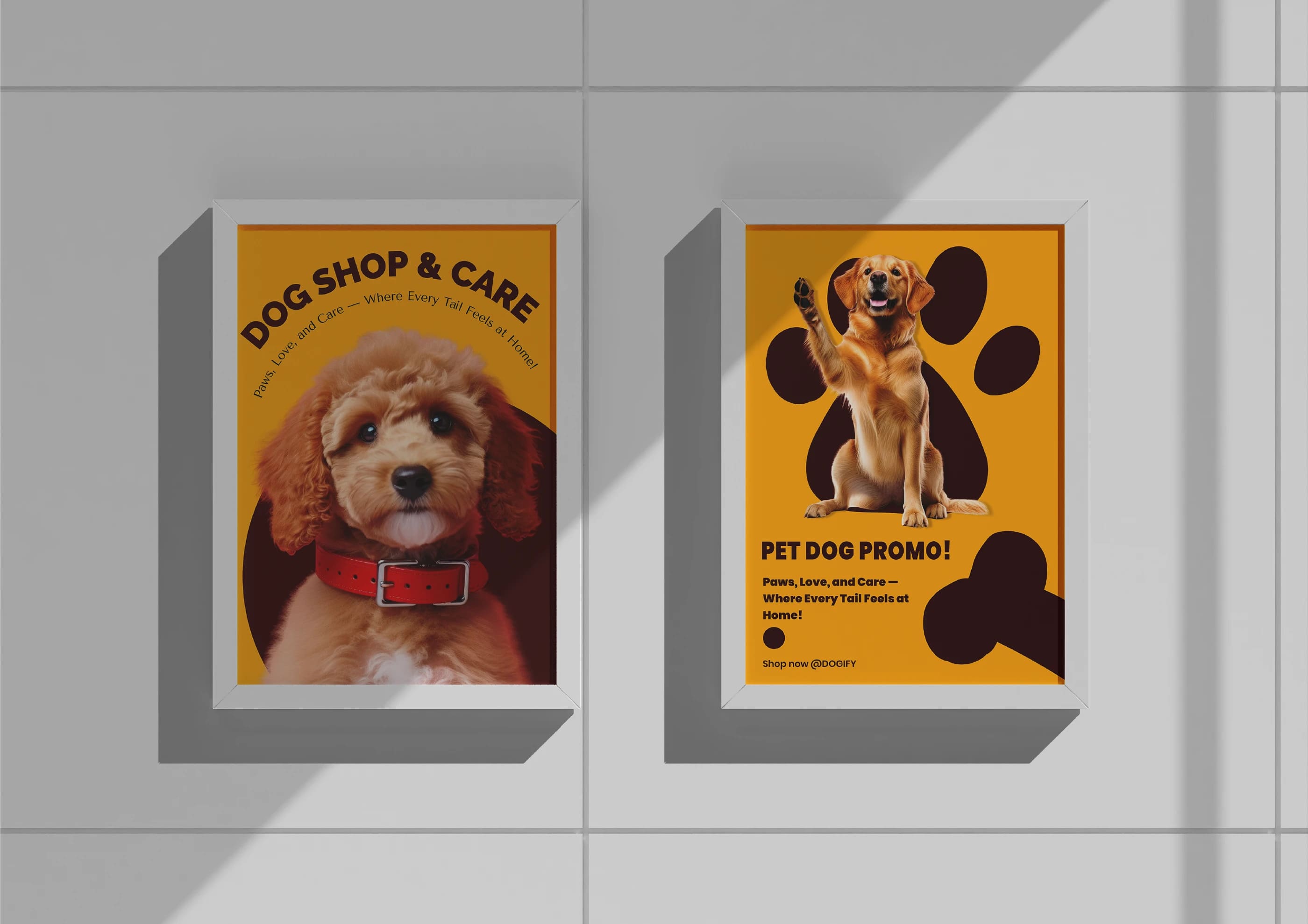
The experience is designed to feel reliable and human. From logo applications to packaging details, visual decisions reinforce clarity and emotional ease. The brand presence stays approachable, but never casual — creating trust while still leaving a distinct impression.
Innovation. DOGIFY’s innovation lies in tone. Instead of relying on familiar pet-industry cues, the identity introduces a visual language that feels restrained yet expressive. It proves that warmth doesn’t require excess, and premium doesn’t need distance.The system is flexible by design. It supports consistency across touchpoints while allowing room for storytelling through color and form, giving the brand space to grow without losing coherence or character.